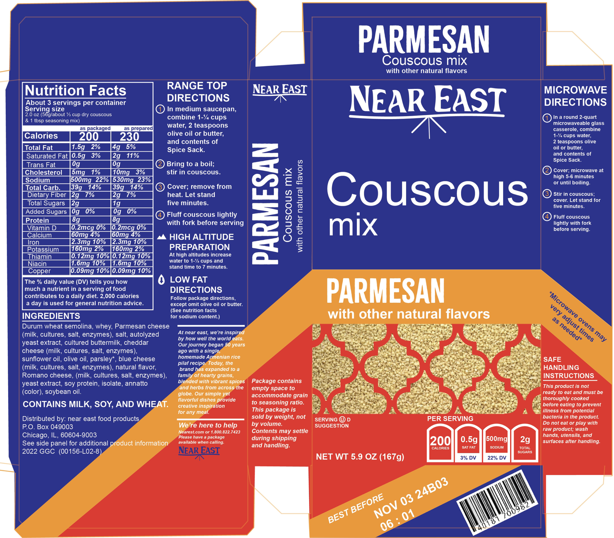
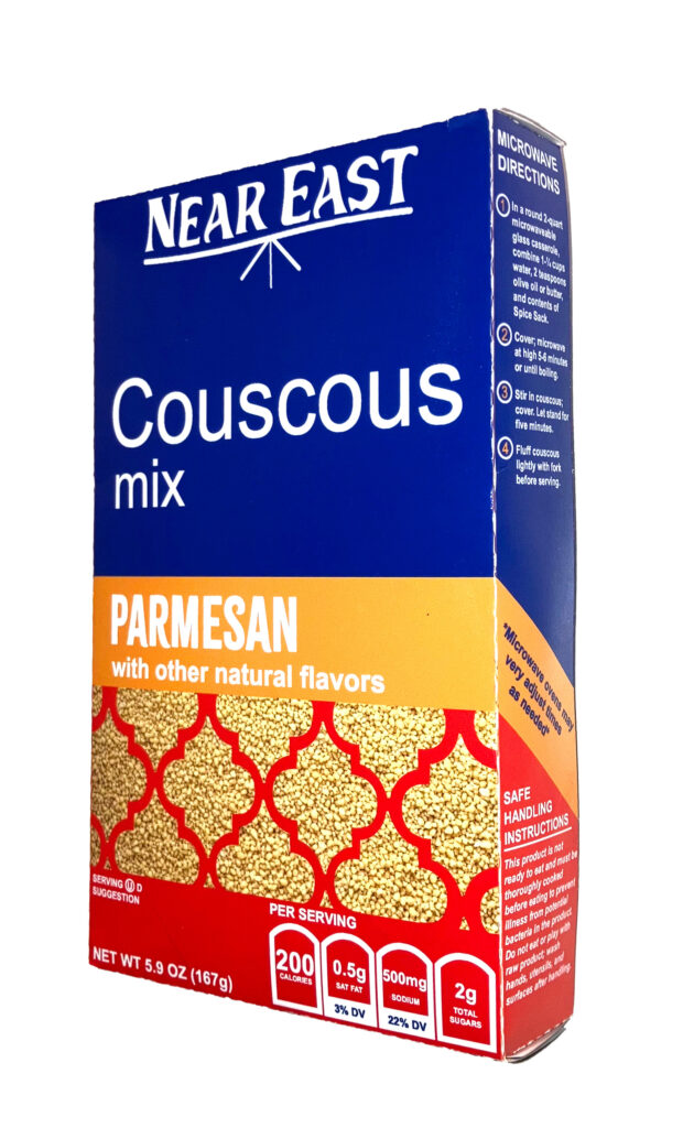
Rebrand for Near East products. A new and fresh take on their parmesan couscous, with visuals derived from Moroccan and Algerian heritage and culture. Also, couscous is a not a grain, but rather classified as a pasta, so that is pretty rad.
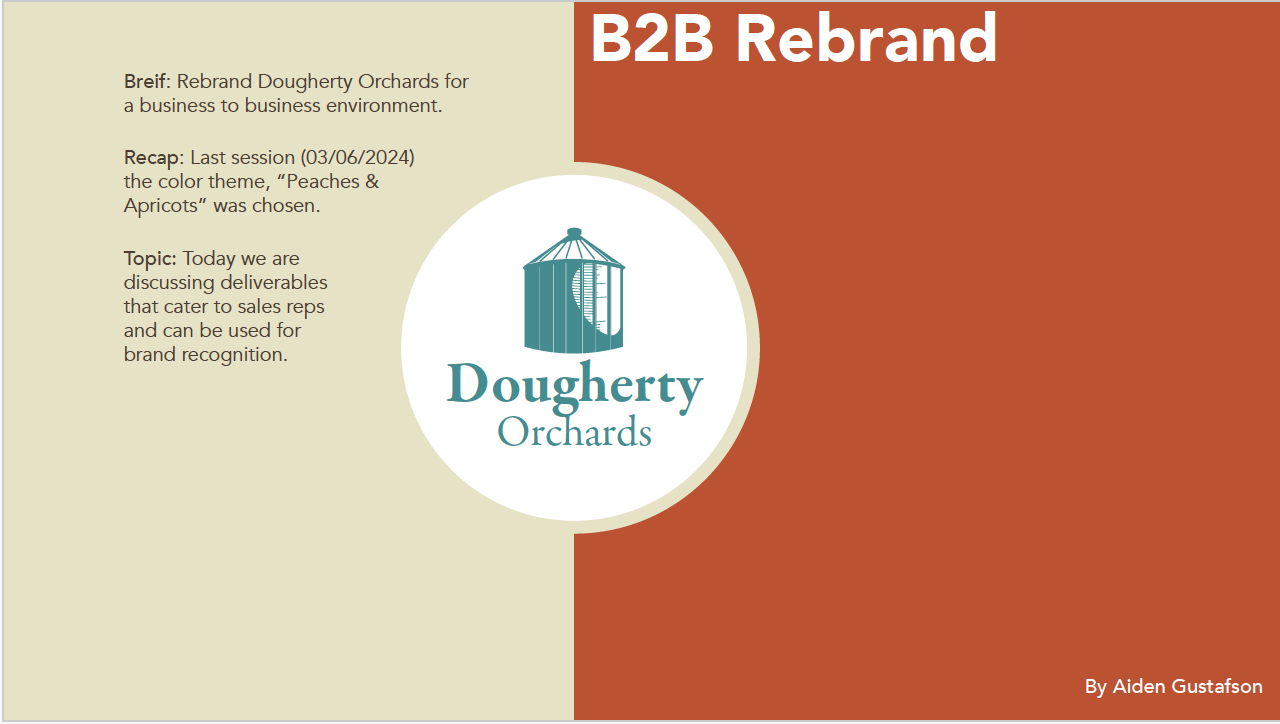
B2B Rebrand
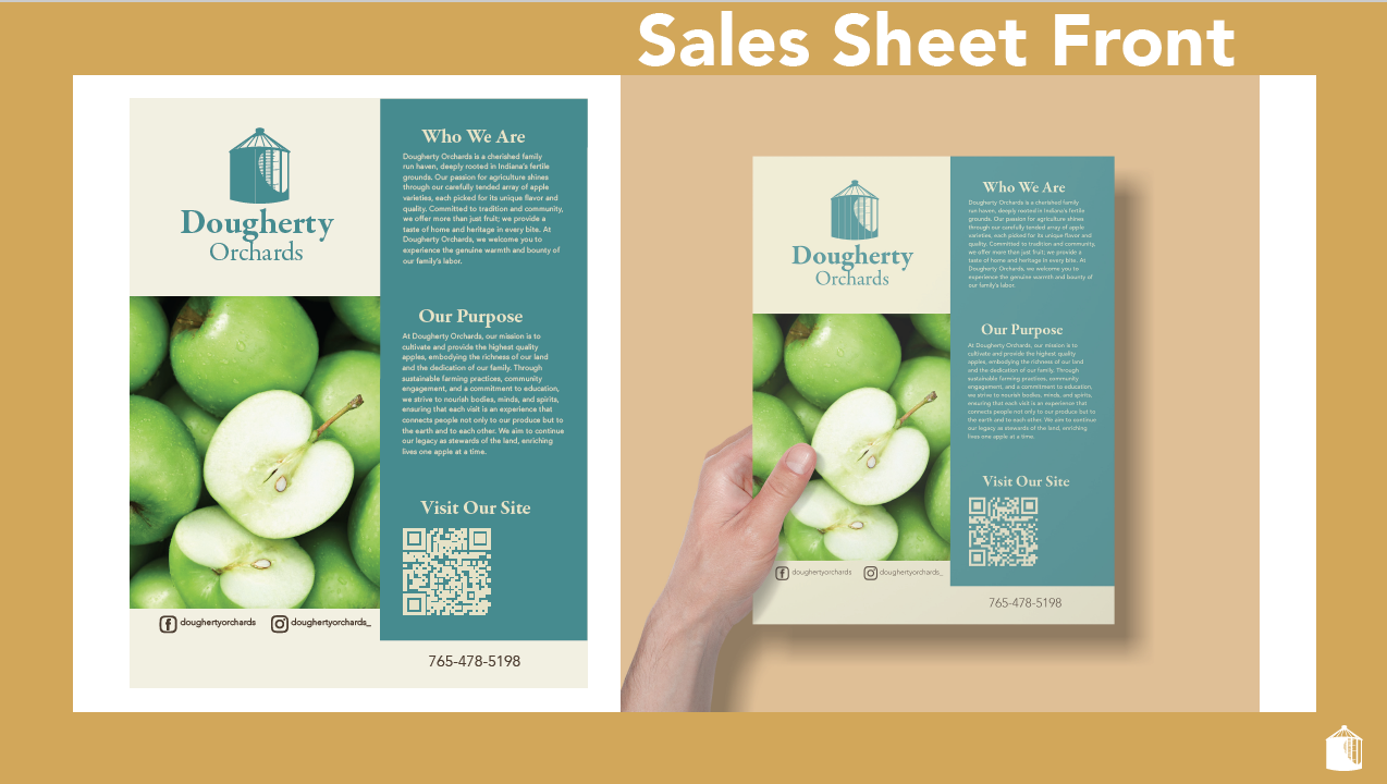
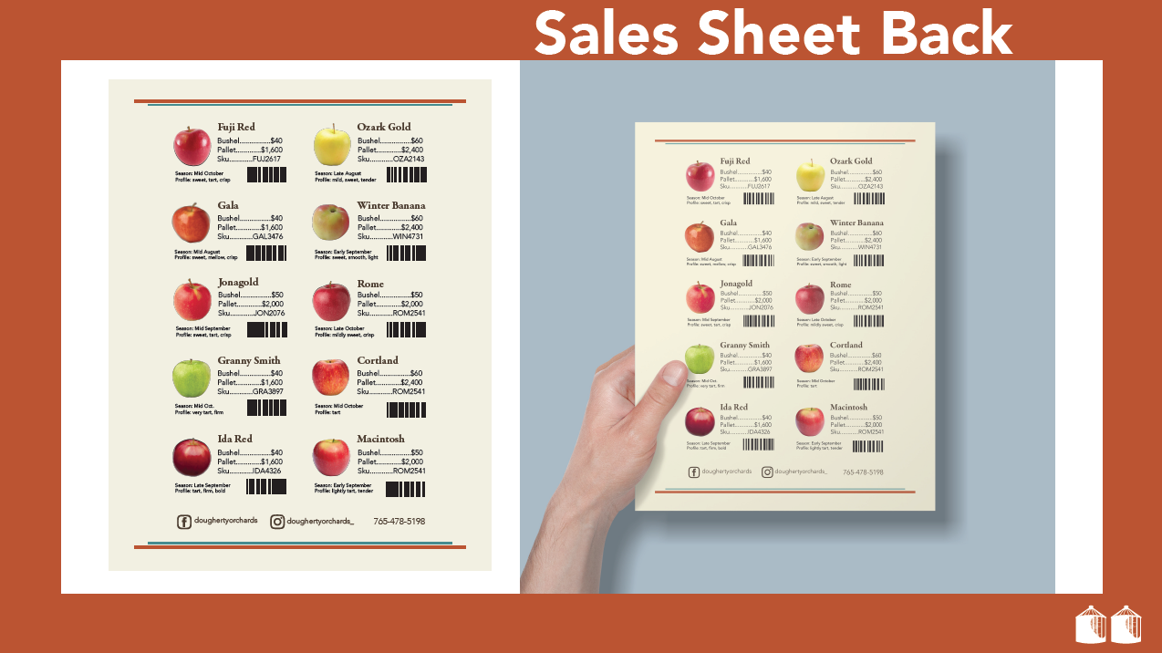
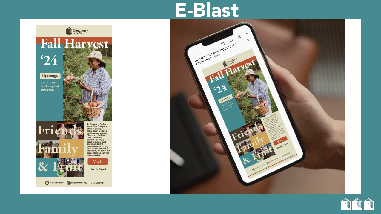
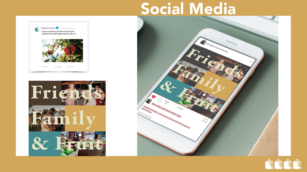
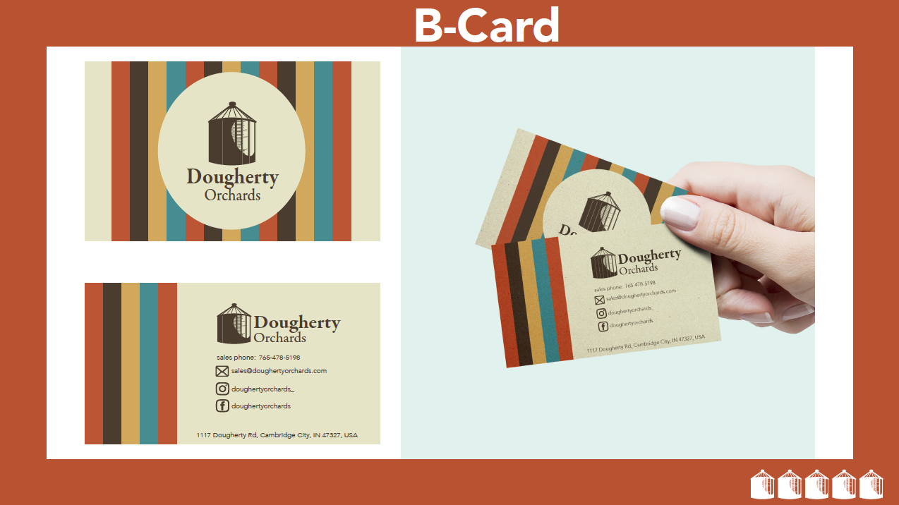
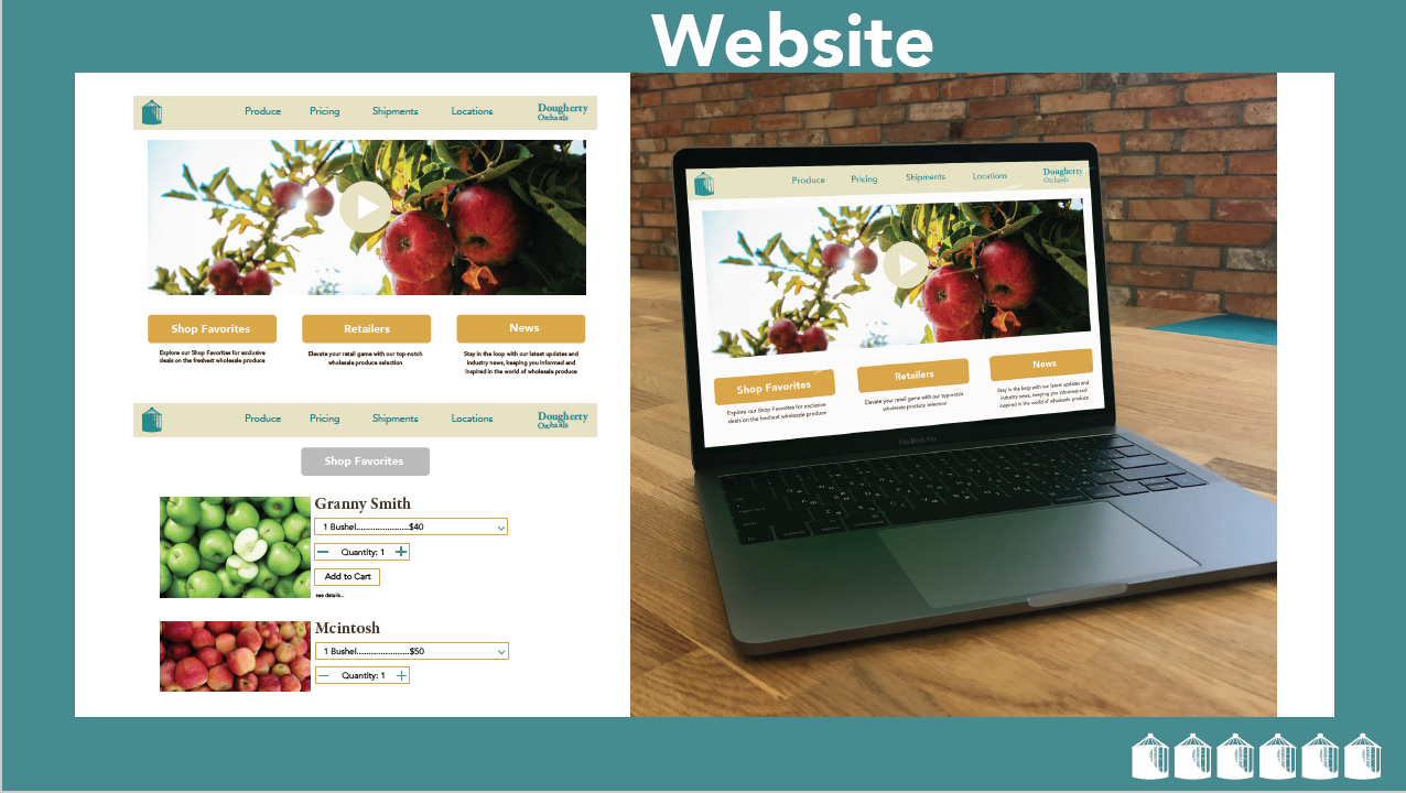
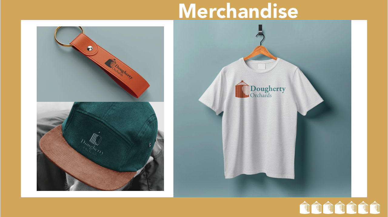
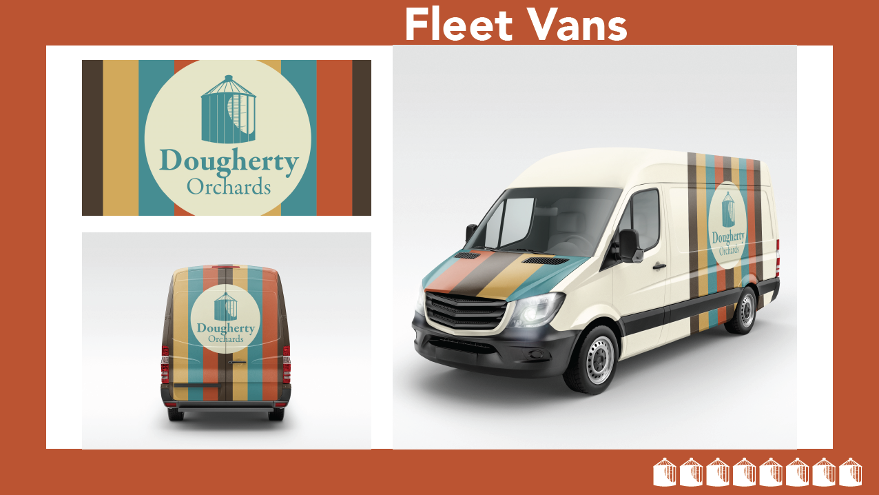
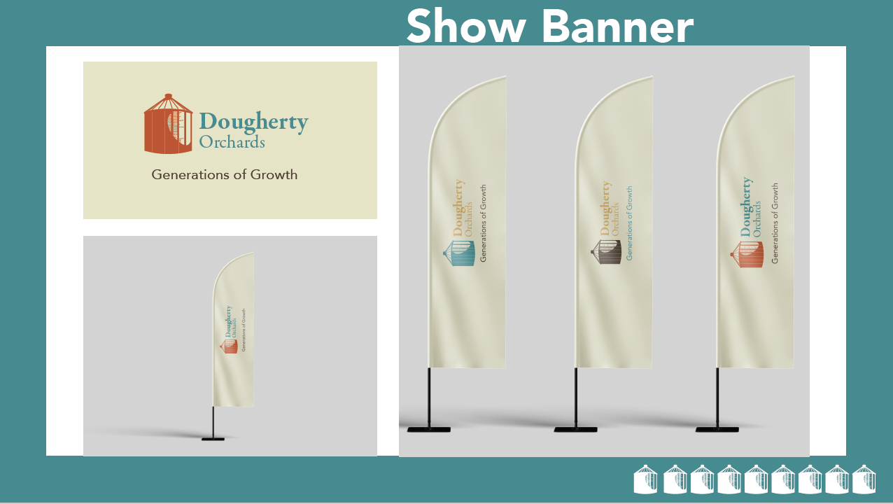
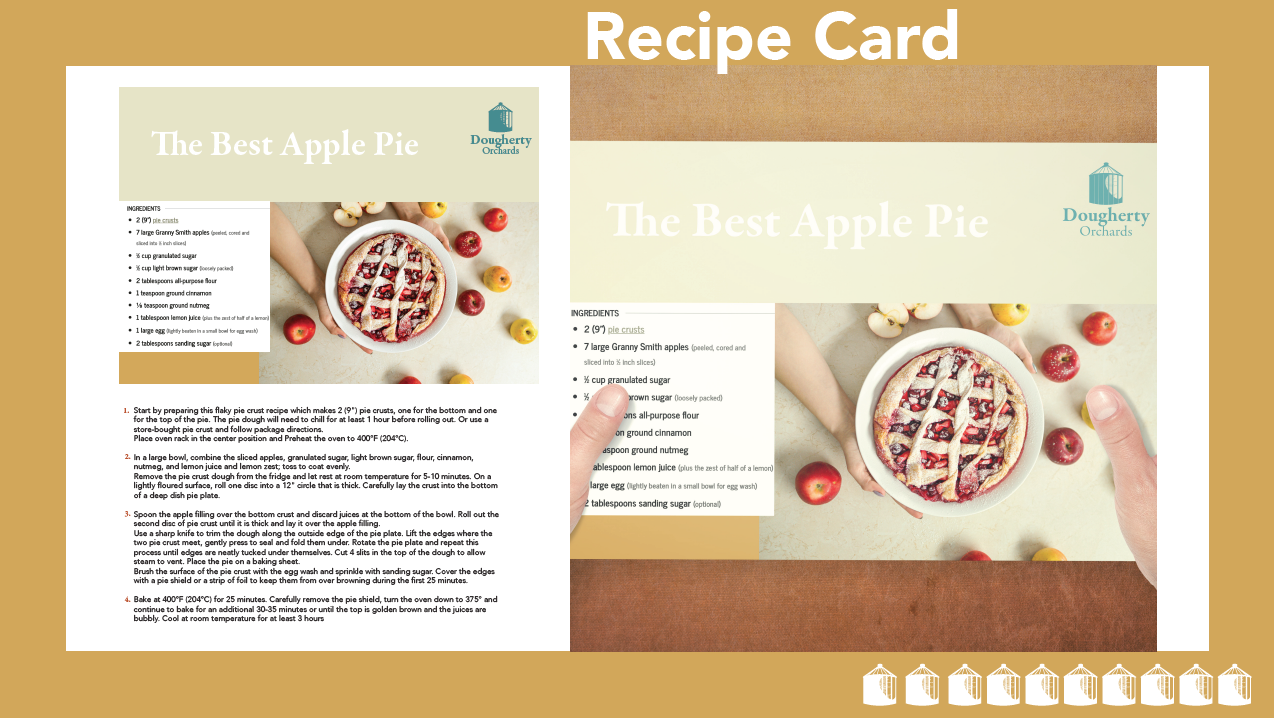
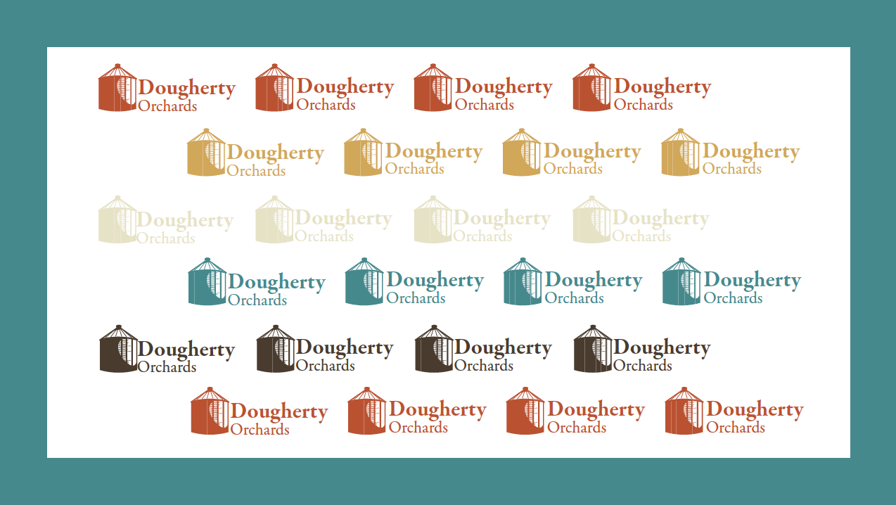
Rebrand of Dougherty Orchards to fit a B2B environment. Dougherty has been around since 1883 and is the oldest orchard in Indiana, they have been a local hub for apple picking, good food, and live music for decades.
Bumper Ads
Collection of three bumper ads for Native deodorant. Using the power of AI software and the rest of the tools in my arsenal, I was able to convey a strong message to those across the galaxy, “Alienate yourself from your stench”.
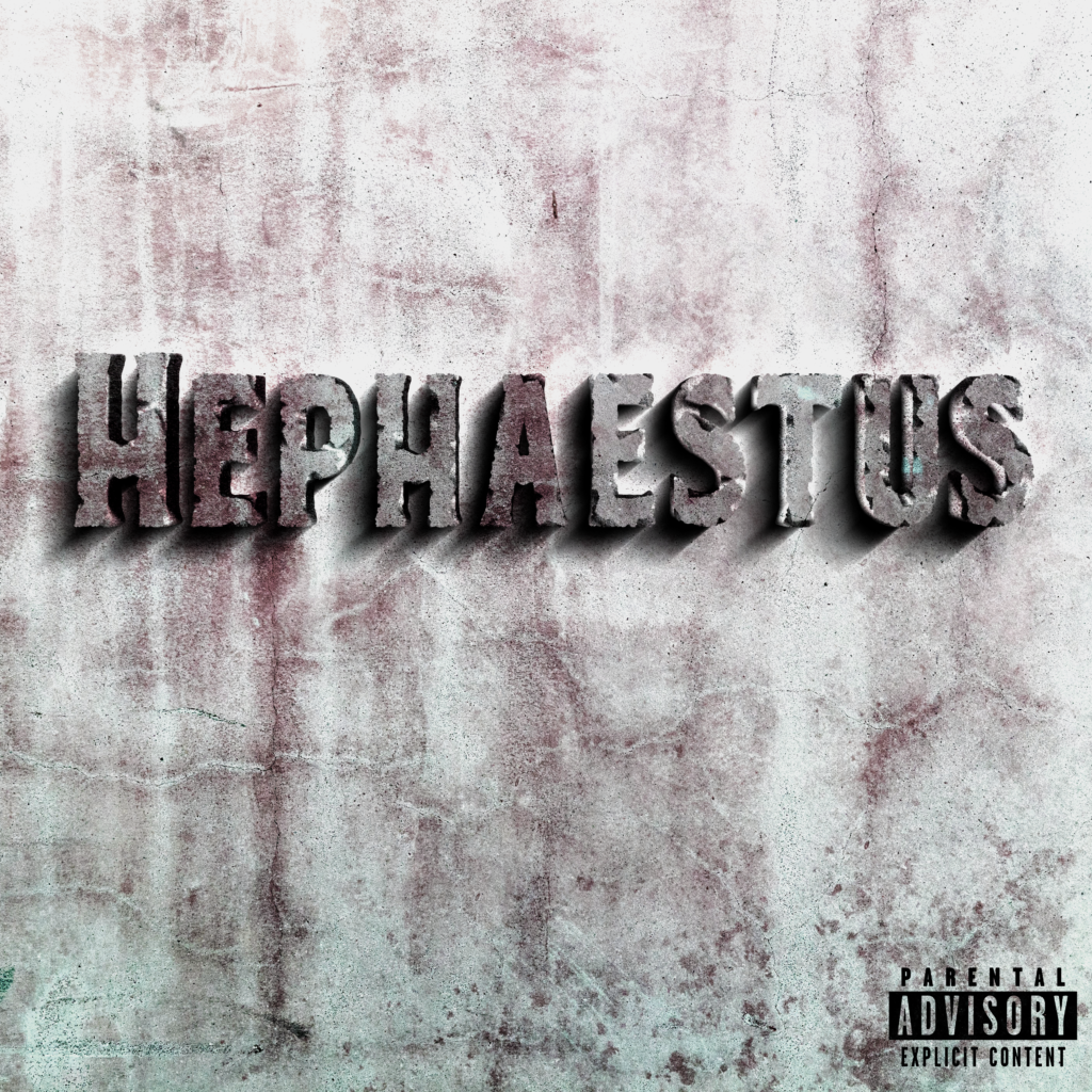
Album cover for a talented friend of mine, who has been making music and releasing projects since High School. Being a part of his creative direction has been a blast. Elija Apollo’s debut album Titled “Hephaestus” tells a story of personal development throughout tough times on the journey of manhood, the sharpening of ones character and the tireless pursuit to make it as an artist. Hephaestus, the Greek God of blacksmithing and sculpture, embodied this journey while giving an interesting angle to develop a concept on. Managing musicians and having input on creative direction has always been a dream of mine, I absolutely love working with other artists and sharing the success when our thoughts come to fruition.
Jumping into the 3d world is a scary leap, but man is it worth it. This short animation was modeled from the ground up using Blender 3d software. Motion graphics, particularly 3d motion has exploded in popularity over the last few years, so I decided to get my feet wet…I ended up diving in head first. From poly modeling, materials, camera motion and all the small skills between, I can finally say I have found confidence within 3d software. More than twenty hours were spent in this short project, but learning the basics of 3d has completely opened up new paths for future projects.
GrowthSans Typeface
GrowthSans was created to commemorate a time of adversity in my life, one where I knew if put in the work on myself I would be rewarded. The high contrast of the stoke widths references the highs and the lows that accompany life, and the growth that can happen in-between. Use the link below to download this typeface.
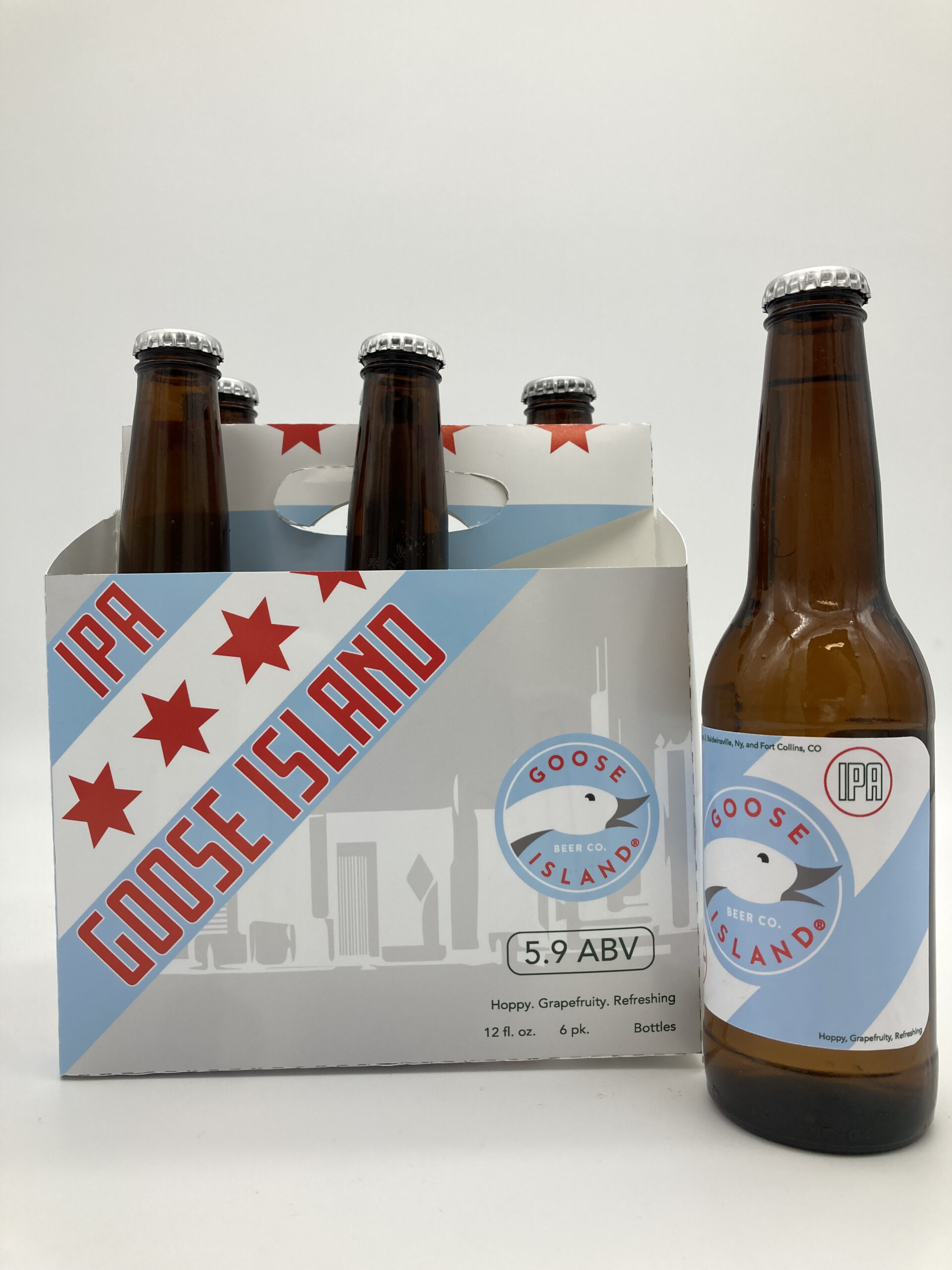
Redesign of a 6 pack found in the local grocery store. Goose Island Beer Co began in Chicago in 1988, amidst the legendary bulls era and a time most Chicagoans hold near and dear. The original package features a green and gray color palette with leafy illustrations. The original package failed to get across the idea of Goose Islands brand identity and instead relied on illustrations that related with the word “island”. For my redesign I focused on telling the story of Chicago in the late 80’s and early 90’s. Design, package construction, bottle label construction, and final photos by me.